Overview
As design lead and Creative Director working closely with Executive Creative Director Chris Lennox Smith, I architected a complete visual language system to communicate Google's leadership philosophy for their School for Leaders initiative. Through systems thinking and iterative design, reduced the entire framework to its essential elements (dots and lines), creating an elegant, memorable visual language that communicated profound ideas through radical simplicity.
The Challenge
Distill Google's leadership philosophy into a single motion piece that would communicate abstract leadership concepts visually, work across cultures and contexts, inspire Google's leaders globally, and capture the essence of what leadership means at one of the world's most influential companies. The script explored concepts like "adaptable mindset," "lifting people," and "futures worthy of our past." How do you visualize abstract principles in ways that feel universal, timeless, and deeply human?


The Approach
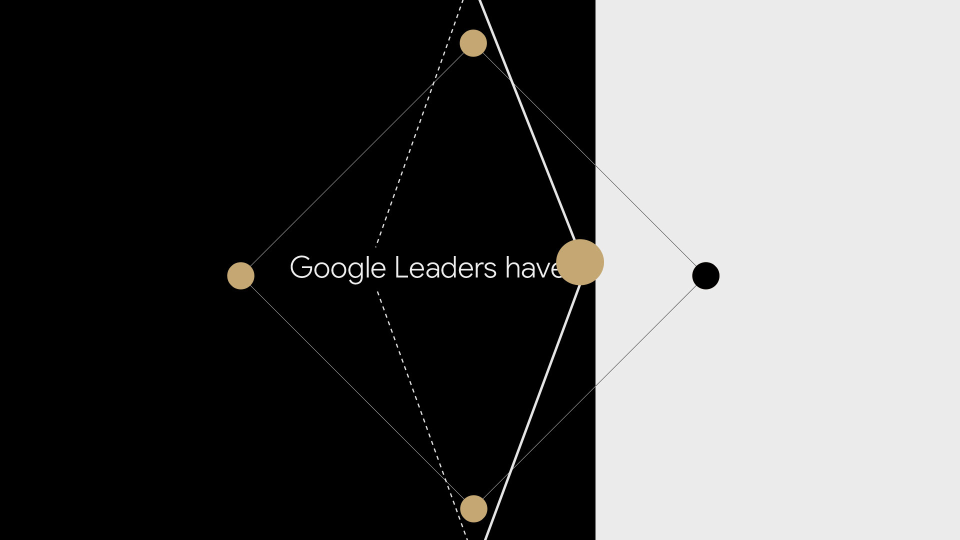
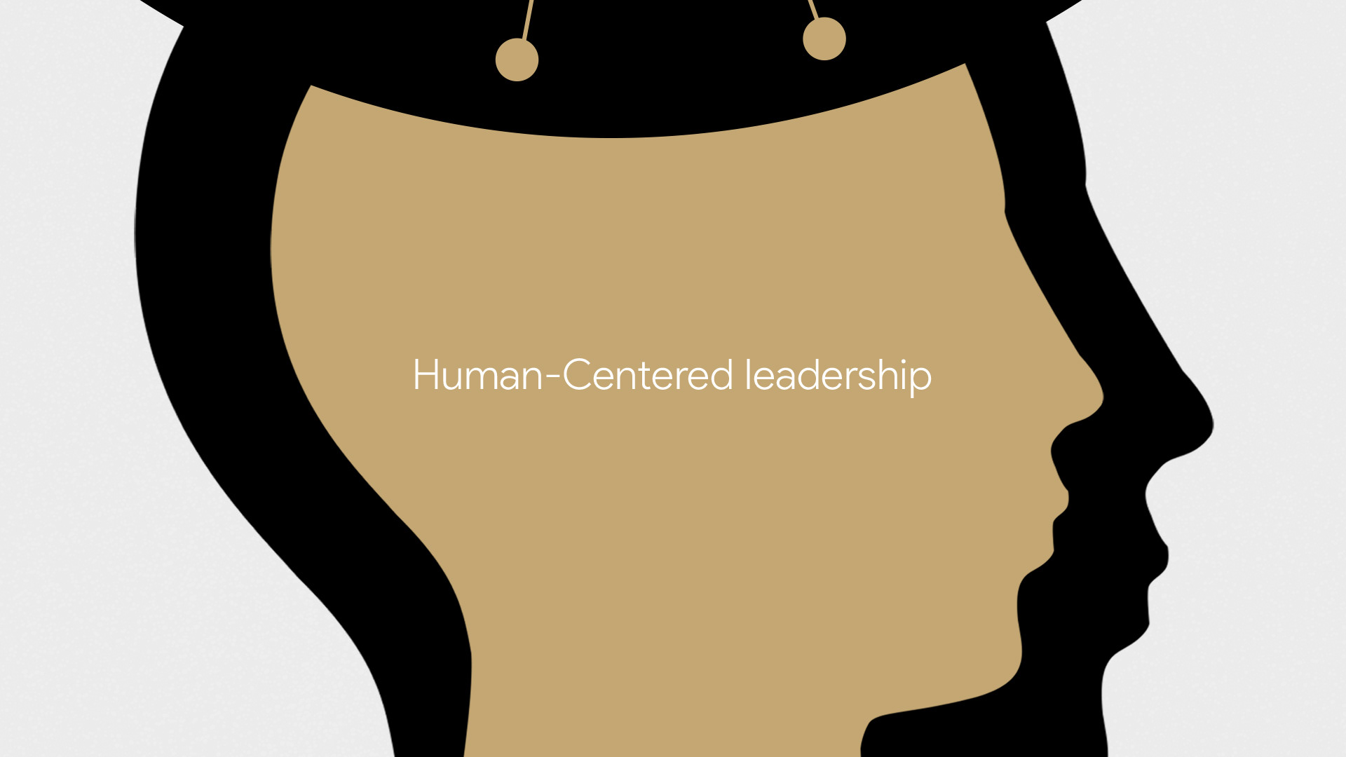
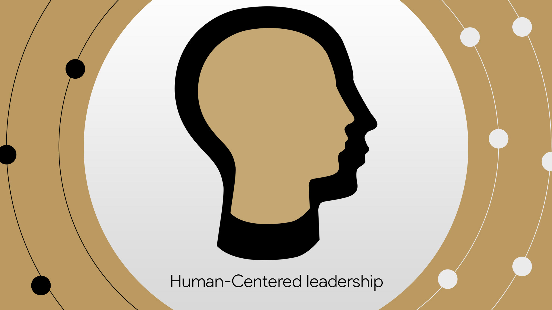
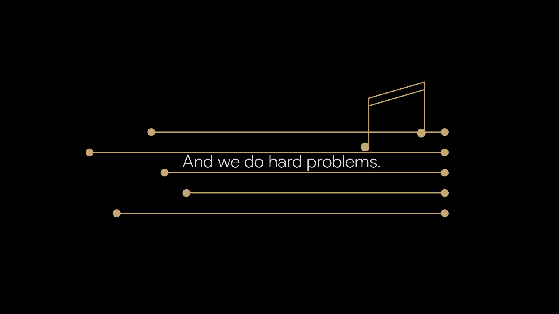
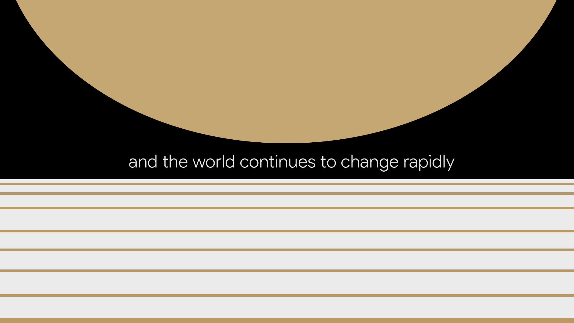
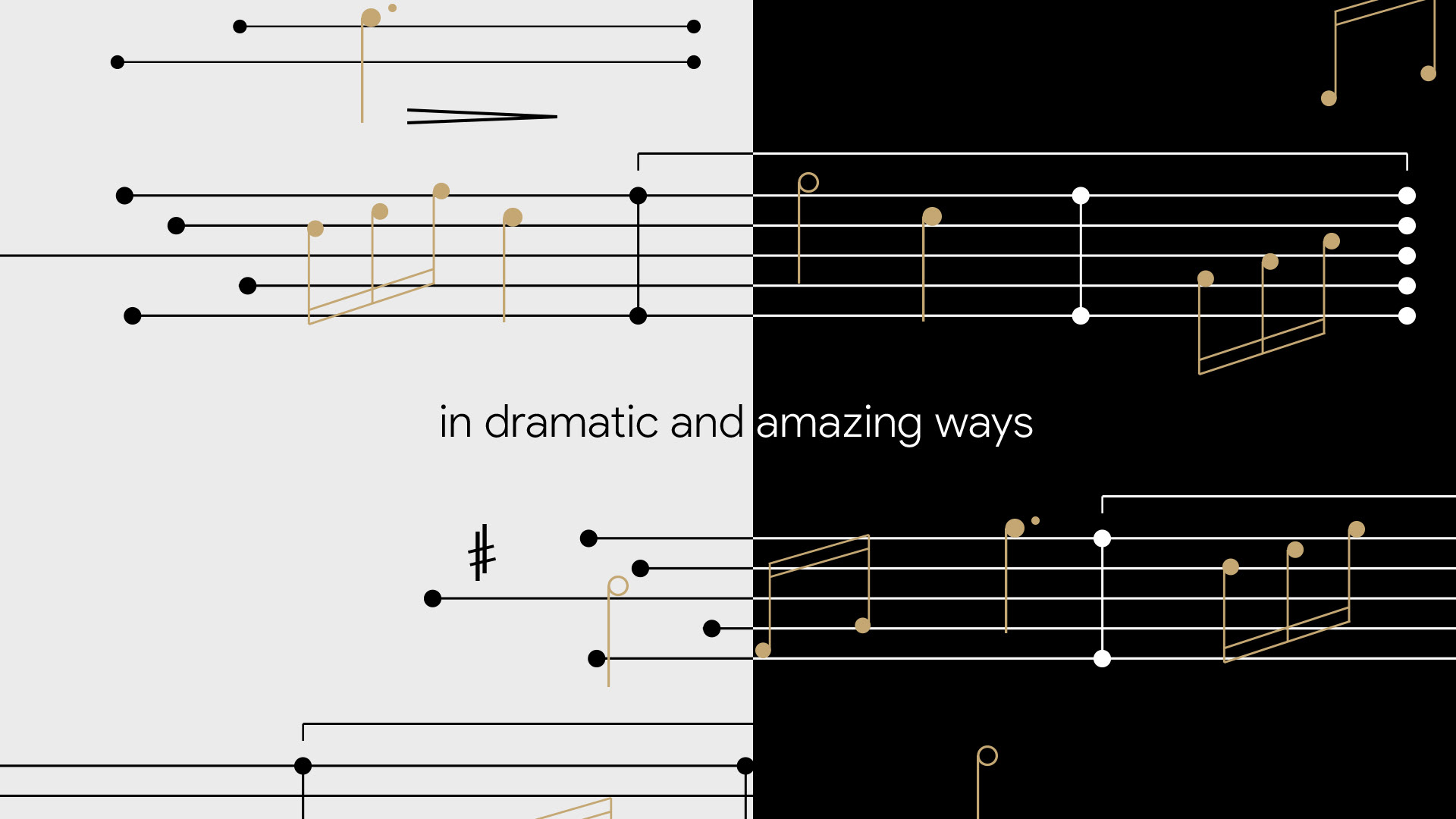
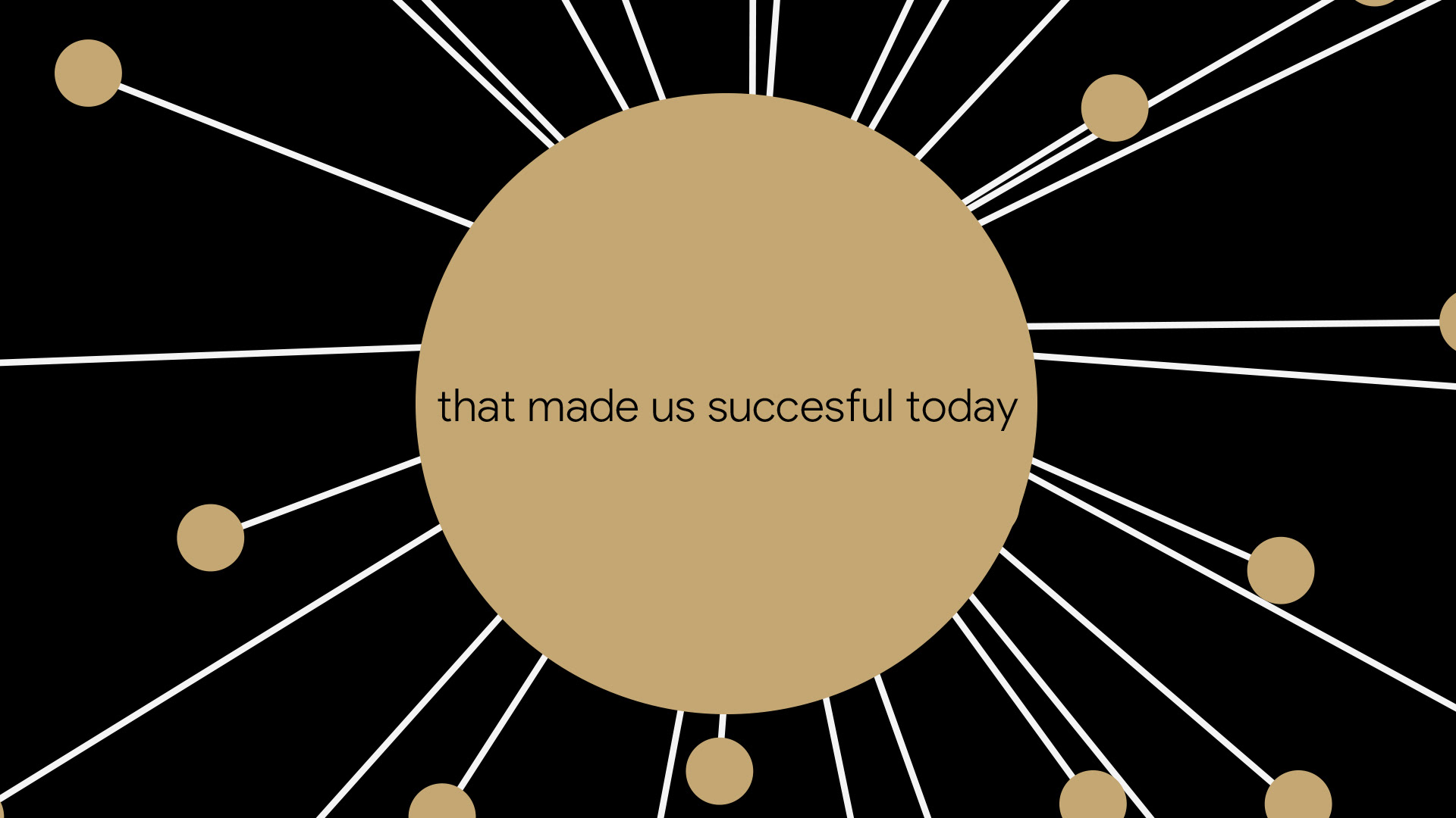
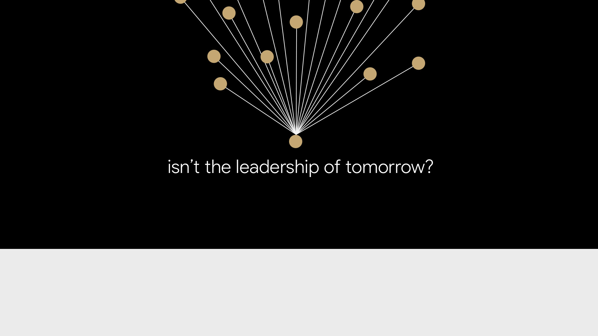
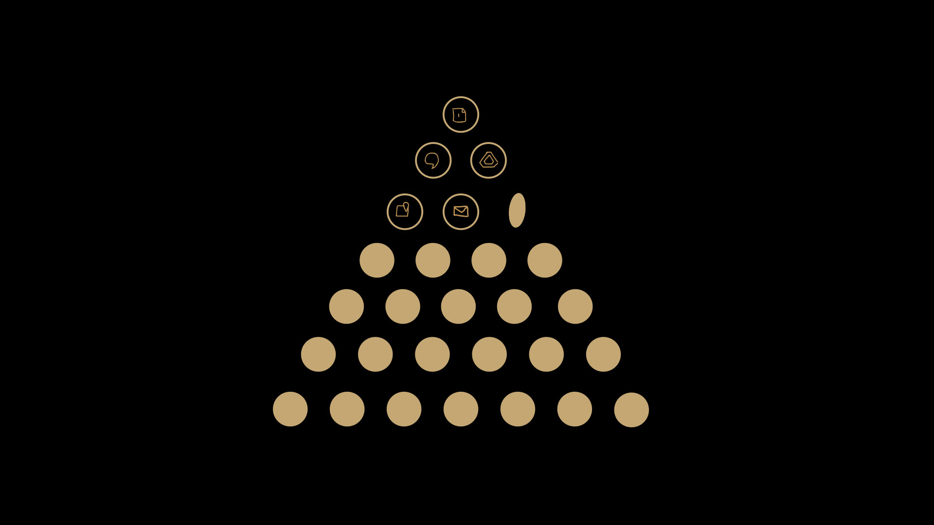
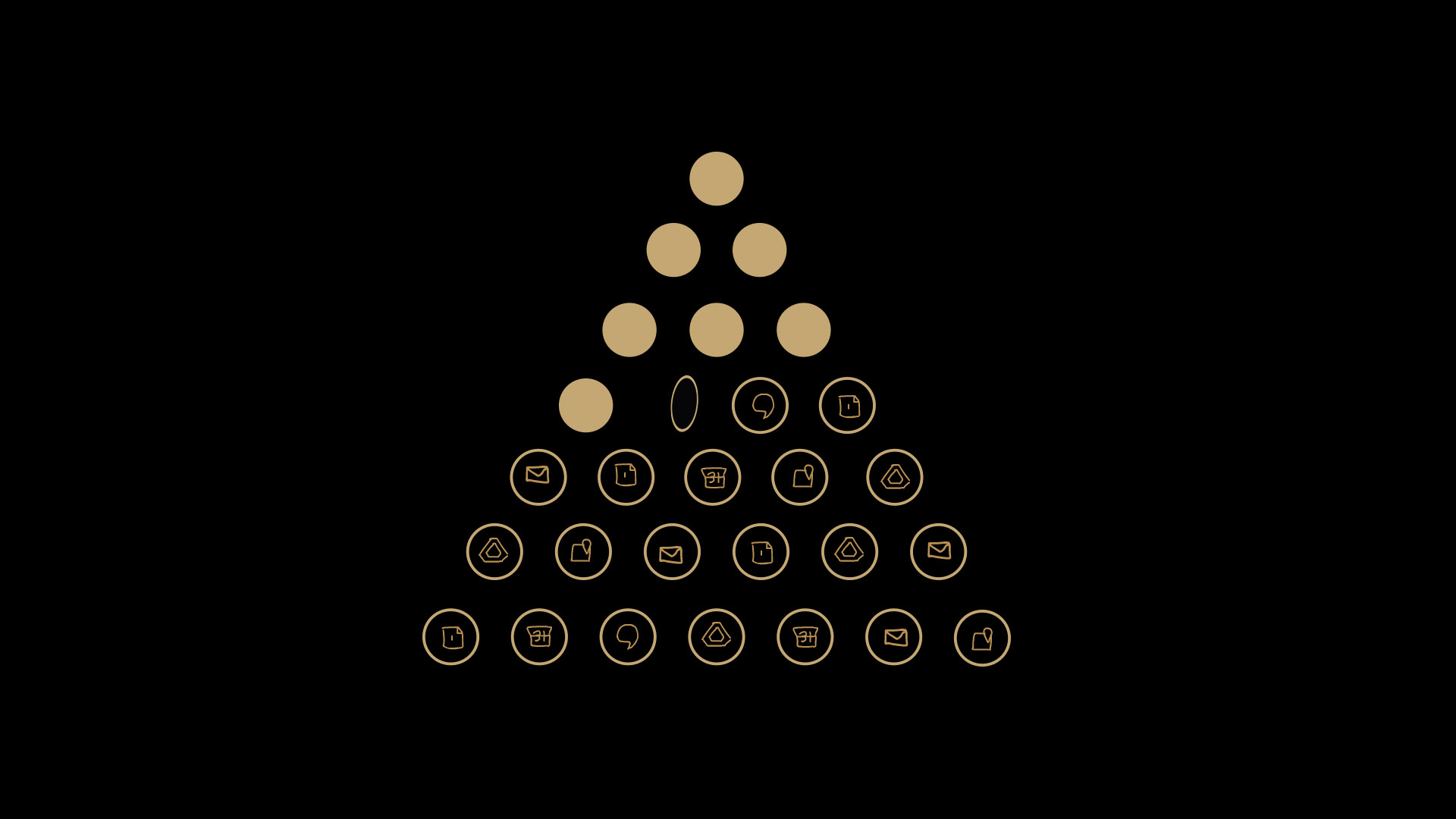
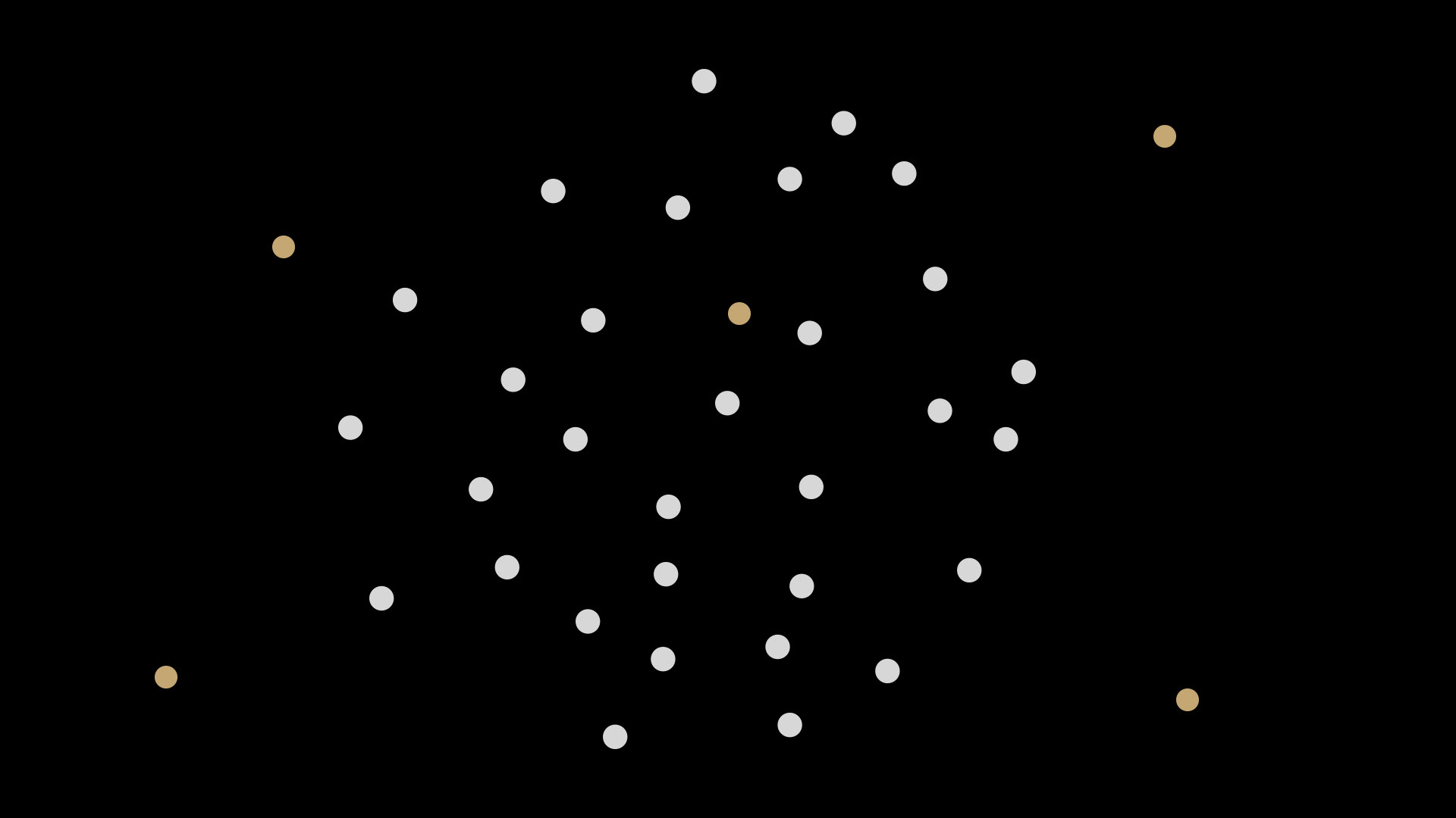
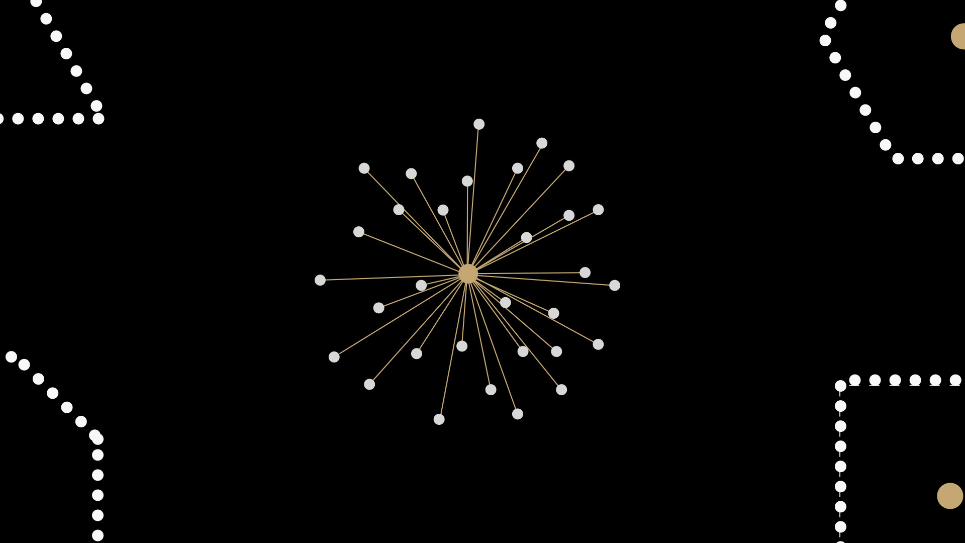
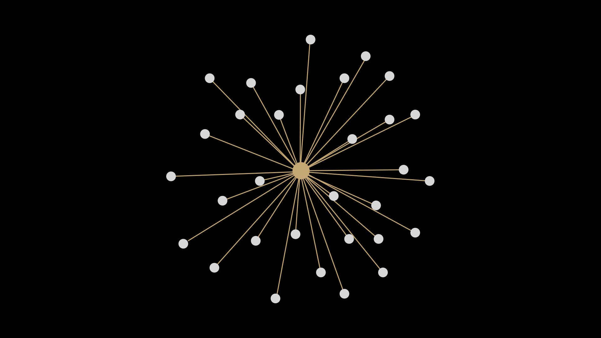
Architected a visual language system grounded in two foundational principles: Sacred Geometry, where every arrangement holds distinct purpose and intention, and Organic Modernism, the architectural practice of melding natural forms into structured systems. Through iterative refinement with the evolving script, the solution emerged: eliminate all text and communicate exclusively through dots and lines. Dots represented individual leaders, people, and potential. Lines represented connections, relationships, paths, and growth. This distillation to essential elements created a framework both universal and conceptually rigorous. Once the visual system was established, I led an elite team of animators to execute the vision through motion design that brought these visual metaphors to life.
Above some early style frames from the R&D phase vs below some near final designs:
Above some early style frames from the R&D phase vs below some near final designs:














The Result
A visual language system that communicated Google's complete leadership philosophy through radical simplicity. The system I created gave animators a framework to work within while allowing for individual artistry. This project articulated values I deeply connect with: building adaptable leaders who drive amazing work while lifting their people, creating futures worthy of our past.
Strategic Context
The parallels to synthetic production are direct. Challenge then: take abstract leadership concepts and create a visual system that communicates them universally and can be executed by a team. Challenge now: take brand creative vision and create AI prompt systems/workflows that execute it consistently and can be scaled across teams. The medium changes, but the systems thinking remains the same.
Credits
Client: Google
Production Company: Mixtape Club
Executive Creative Director: Chris Lenox Smith
Creative Director & Design Lead: Felipe Posada
Animation: Felipe Posada, Deekay Kwon, Mary Varn, Sean McBride, Casey Drogin
Technical Direction: Casey Drogin
Production Company: Mixtape Club
Executive Creative Director: Chris Lenox Smith
Creative Director & Design Lead: Felipe Posada
Animation: Felipe Posada, Deekay Kwon, Mary Varn, Sean McBride, Casey Drogin
Technical Direction: Casey Drogin
